The Greeting Card Saga

I can't tell you why this ever seemed like a good idea.
During the 2021 holiday season (mid-November, to be exact), I decided that I wanted to sell art prints. I chose a handful of small paintings and placed an order for some 8 x 10 wall art and some holiday-themed cards.
Unfortunately, that project was doomed from the start. After I placed the order, I realized just how little time would be left for you to buy the cards, let alone write and mail them out to friends and family. With Christmas just over a month away, I panic-stressed every day until the prints finally arrived...
Let's just say they did not turn out well. The colors were muddy, washed out, and not life-like in the least. The print shop offered to try again, but long before the second batch of prints arrived (looking only slightly better than the first), I knew it was over.
There was just no time left.
Defeated, I announced the cancellation to Instagram and went on holiday break early. For months, I painted page after page of flowers, trying not to think about the box of sad-looking prints still sitting in the corner.
Then one morning in August, an email arrived.
"Good morning," it read. "I did not find greeting cards on your website. Do you think you can provide any?"
I was in the middle of developing the Watercolor-Bordered Calligraphy line at the time, so you'd think I would have said no and use that project as an excuse.
But strangely enough, the idea of trying print again no longer felt terrifying.
I spent hours researching what went wrong the last time around, invested in a couple new tools, and started learning how to use better editing software. Most importantly, with the help of a few artist friends' recommendations, I found a new print shop.
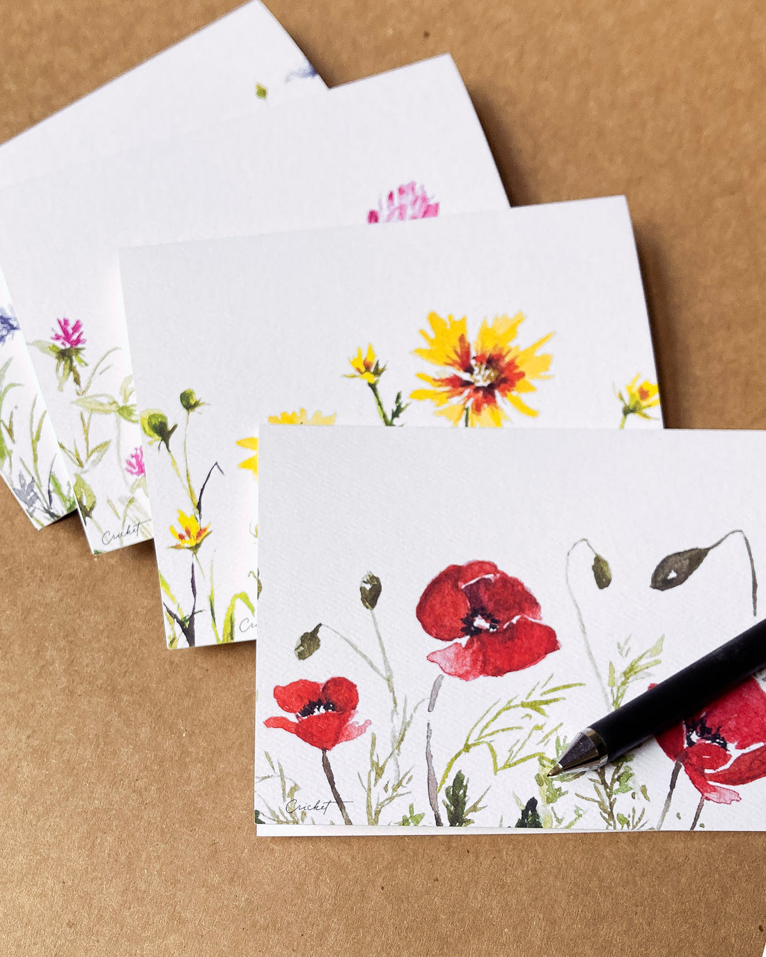
This time, the test prints defied all expectation.
The colors were so vibrant, and all three types of paper I sampled felt incredible. I turned to the Signed Cricket email list and IG friends for input, and this is the paper texture that we decided to go with:

So here we are.
It's been almost a year since the Great Print Disaster, as I like to call it, and you know what? It was worth it.
Trying and failing taught me that quality prints take more time and planning than I had realized. Those first prints were ugly, but now we have a beautiful collection in their place.
When you hold these vibrant, luxuriously heavy cards in your hand, I believe you'll love them too 💛